What You Don’t Know
Can Hurt You
Author and creator © Mike Boatman 2019

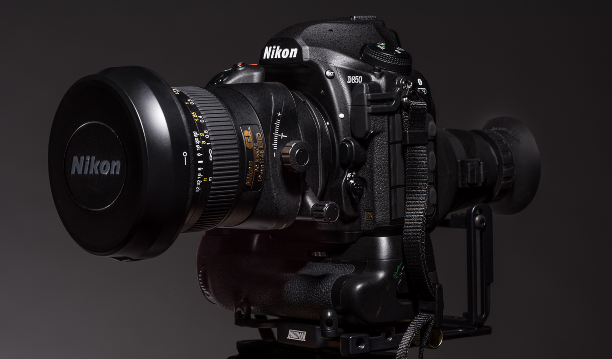
D850 with 19mm Tilt Shift PC Nikon lens
Gosh dog! It’s hard to believe I’m in my 40th year as a full-time commercial advertising photographer. All my assistants over the years would tell you that one of the things I’ve emphasized is this:
You don’t know what you don’t know because you can’t see it. Once you can see it, you know it forever.
Young photographers think they know everything because they can’t see it. Once someone points it out to them, then they see it everywhere. Therefore, critiques are extremely valuable.
I’ve learned that this is also true for buyers.
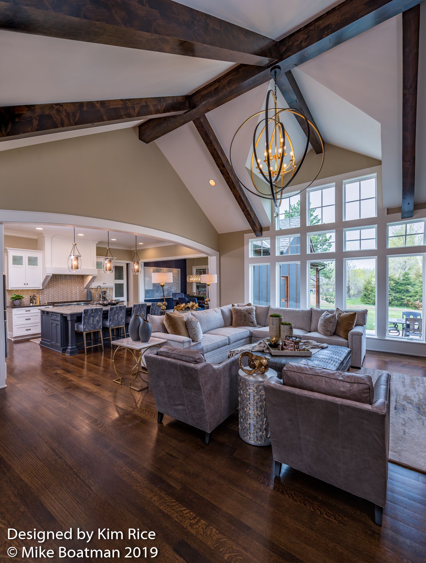
My most recent assignment was for interior designer, Kim Rice, of R design in Kansas City, Kansas. Kim recently told me that her ROI (return on investment) on my photography was outstanding. Since then I have added even more value to my services, which is what I’d like to chat about here and use samples from Kim’s assignment.

Kim Rice of R Design assignment Kansas City
To clarify, I’ll explain some background:
For the majority of my career, my camera format was a 4 x 5 view camera or larger, photographing on transparency film. To most current buyers, this probably means nothing, but old-timers know that transparency film was completely unforgiving with a luminance range of roughly 7. Today’s digital cameras have a luminance range of closer to 17. (The human eye is around 23.) This may also be Greek to most of you, but in basic terms, the higher the luminance range, the greater range of seeing bright to shadow.
The 4 x 5 view camera was an amazing tool because it had swings, tilts, and shifts available for the front lens board and the rear film board. What the swings, tilts, and shifts gave you was the ability to distort reality.
Traditional cameras and digital SLRs cameras of today are referred to as fixed body cameras, which means they didn’t have swings, tilts, and shifts. Digital SLRs cannot correct or distort what the camera records. Of course, today’s reality is that images can be easily corrected or distorted with Photoshop. But, at what cost?
There’s the obvious cost of editing time. Another cost is to the quality of the image and limitations of the format. I could jump deep into the weeds technically but, frankly, it would be wasted effort for what buyers need to understand. That’s why you’re paying me, an expert!
The value I’ve added to my services is a new tool in my array of lenses … the 19mm Nikon PC lens with tilt and shift controls. Nikon recently added the 19 mm PC lens to their inventory. PC (perspective control) lenses are not new, but until recently they were normally in the focal length range of 35 mm. A 35mm is just too long a focal length for most architectural and interior assignments. Nikon also has a 24mm tilt lens, but it does not have shift.
I’ve found that even though I worked on a 4 x 5 view camera for the majority of my career, I still don’t have the same level of control with the new PC lens. However, I feel much more at home with familiar perspective controls at my fingertips.
Without a PC lens, the photographer would use a very wide focal length lens and then correct perspective in Photoshop. This can be limiting because you’re throwing away a portion of the image. Plus, tilt shift lenses also can change the depth of field focus plane which traditional wide-angle lenses on a fixed body camera cannot do.
The main distortion or correction for an architectural photographer is to correct the keystone effect. With a fixed body camera, the second you tilt the camera up or down the vertical lines are no longer vertical. They are either slanting in or out depending on which direction you tilted the camera.
Why does it matter?
When we tilt our heads up and down, our human brains apply human software to maintain vertical lines as vertical even though the physics of the way our eye works is the same as the camera. The human eye sees vertical lines as vertical. That might be worth repeating! At this point, the camera does not have internal software to correct the keystone effect. If you tilt the camera, your vertical lines are not going to be vertical. This looks strange in a photograph.
The human brain subconsciously pays attention to the lines in an image, even if we consciously don’t acknowledge it. Subconsciously, and in many cases consciously, we are saying there’s something wrong with that photograph.
As a buyer, interior designer, architect, or a builder, do you really want images representing your work where the first impression is, “There something wrong with that photograph.”? Everything that represents your business is a reflection of what you bring to the job. If you use mediocre, flawed photography then, obviously, your work is mediocre, and we should expect flaws in your in product. If you send out a business letter with typos then, obviously, you don’t pay attention to details or you don’t care enough to educate yourself. It’s all a reflection and a representation by which you’re being judged.
With my new lens acquisition with shift and tilt, coupled with a 45-megapixel camera, I’m now able to produce incredibly highly detailed vertical stacked panoramic images that capture the floor to the top of the vaulted ceiling while simultaneously correcting any keystone effect.

Kim Rice of R Design assignment Kansas City
For Kim Rice at R Design and all my architectural clients, this means that I’ve just increased ROI. Before, I had been delivering technically perfect images, but now I can add images that were not possible with just a wide-angle lens and a fixed body camera. This will make Kim’s visual representation unique among her peers. That’s something else we humans pay attention to … uniqueness.

There are no comments